CHALLENGE
A branding agency needs to show they do more than just make pretty logos.
SOLUTION
Rewrite their case studies to focus on the strategic value, design insight and creativity they provide.
ROLE
Writer | Content Strategist

FLINT DESIGN CO.
CASE STUDIES
Flint Design Co. has been in the branding business for over 25 years. When they decided their website was in need of a re-vamp, they hired me to turn their case studies into more than the standard boring boilerplate copy.
The pitfalls of a design agency case study is that all too often, the background work, strategy, data and insights don’t come through. I helped Flint position themselves as a branding authority rather than a place you go to get a new logo.
Here’s my approach to a case study template that applied across each of their projects:

This Meat Brand Won’t Get Jerked Around
Case Study • Werner Gourmet Meat Snacks
-
The family behind Tillamook, Oregon’s, Werner Gourmet Meat Snacks is rowdy, irreverent and passionate. After 25 years in business and in the midst of a snack food renaissance, their brand was being overlooked. Their packaging was dated and didn’t reflect the quality of the product or the brand’s history. It was time to sink their teeth into a remedy. With a stable of cured-meat snacks at the fingertips of everyone from long-haul truckers to soccer moms, Werner needed to figure out how to get their foot back in the door. We led the Werner family through a brand redesign to reignite the consumer’s lasting love of their product—with a healthy dose of seasoning for extra flavor.
-
If You Only Read This, Know That:
Flint helped Werner effectively strategize and position their brand in a saturated convenience and grocery category.
Flint revitalized Werner’s relevancy in an emerging health food and snack market after 25 years and stagnating sales.
Werner’s year-over-year sales increased by 13% following Flint’s rebrand. Spicy.
-
2018, often referred to as “The Jerky Boom” (no citation needed), was a wild time where cured meats became the craveable crossover snacks to make the leap from gas station go-to to Whole Foods staple. The problem the Werner family faced was that they were in jeopardy of losing business, with retailers telling them their packaging just wasn’t making the cut. But this Tillamook, Oregon, family had been in business 25 years—even though the Werners knew the story behind their delectable gourmet meats, they needed a new way to tell everyone else.
Store shelves were overflowing with jerky of all kinds and investors were turning their attention to an industry that had 3.5% sales growth in a year which equated to billions (Washington Post, 2017). Convenience stores were skewing healthier and jerky was ousting candy for the coveted impulse-buy. What all these other brands had in common was their attention to conscientious, healthy ingredients—or at least the perception—with clean design, “all-natural” and “grass-fed” touts and evocative imagery of majestic cattle living their best range lives. Put simply, these weren’t your grandpa’s Slim Jims. Werner’s dated look wasn’t living up to their product and they were facing lost customers and evaporating sales.
-
“Design is so pervasive,” says Designalytics, “that it’s often overlooked as a value-driver in its own right.” Although the Werners were savvy to the impact of superficially updating their packaging, we wanted to show them that it was just the beginning: only through new packaging that connected to core messaging would the brand authentically translate to the customer. When done well, this cohesive approach leads to lasting sales growth and brand longevity. Like selecting premium cuts of beef, we led the family through messaging and brand explorations, allowing us to save only what felt the truest representation of the people, place and process behind the meat. Landing on the imagery and feel that were most evocative to the Werners’ experience began to codify how best to position them. Additionally, after an extensive competitive audit, as well as an analysis of their current product portfolio, we were able to identify where Werner’s brand was coming up short. What the Tysons and Hormels getting into the gourmet meats game didn’t have was this quirky family’s story. The Werners were known in Tillamook for their boisterous personalities and a logging lineage that predated their time in the jerky business. If we could elevate the Werner story and contextualize their personality, we could craft a packaging system that could surpass the competition.
A full reimagining of their logo and identity, messaging and nomenclature took off, as we worked closely with the Werners to show the world what was so damn good about their meats. Combining a robust, rugged look and feel with Americana values, quippy copy and a more comprehensible color hierarchy, the new Werner identity came to life. Not only was their brand on an even playing field with the competition, we helped Werner create a roadmap to greater business opportunities, such as speeding up the launch of a new grass-fed product line, and a more refined approach to audience segmentation.
-
In the 26 weeks following Werner’s brand launch, their year-over-year sales increased 13%. Even though the Werners had a heritage product that could stand up to anybody’s in a blind taste test, their branding and packaging was holding them back. Through our partnership in understanding the true value of design, Werner is now displayed proudly at, and purchased readily from, more gas stations, grocery and convenience stores, than in their wildest dreams. That’s just a little something to chew on.
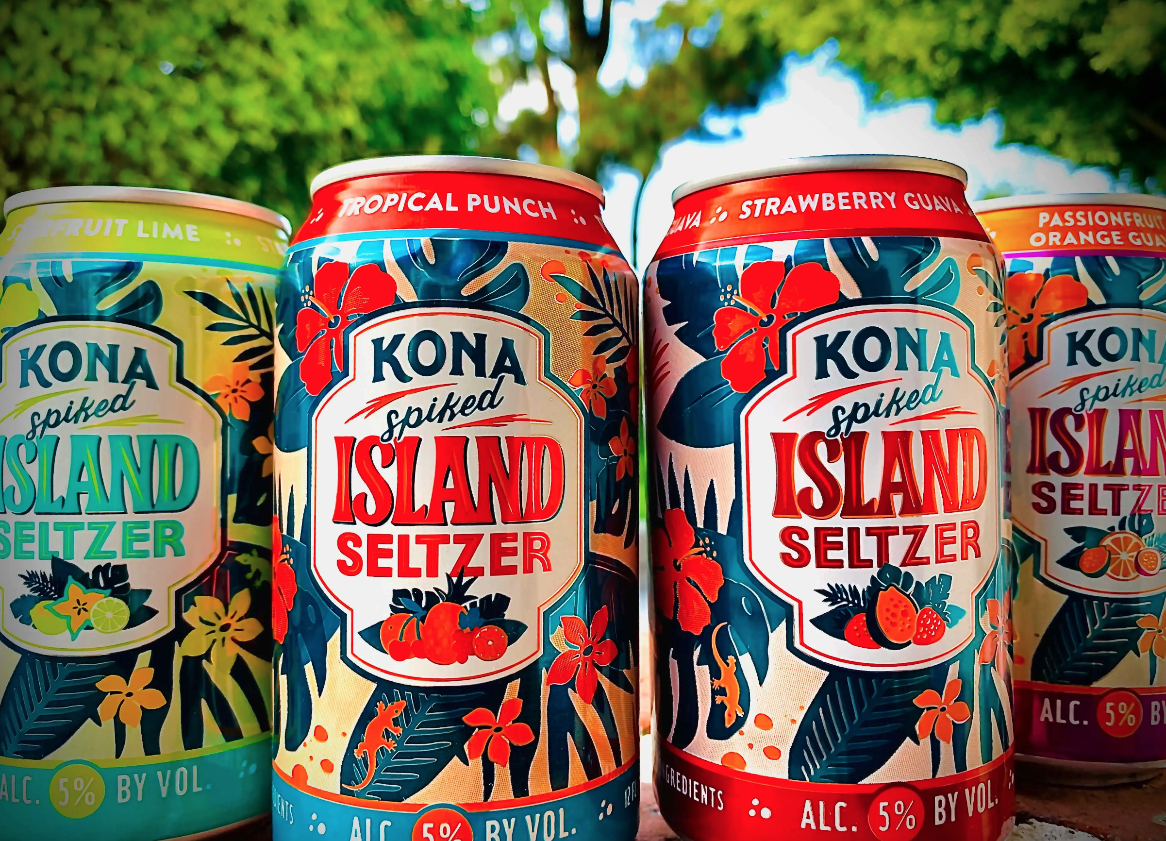
Kona Makes Waves with Spiked Island Seltzer
Case Study • Kona Brewing Co.
-
Kona Brewing Co. is Hawaii’s answer to the craft beer scene. With iconic brews evocative of the island life and environment, Kona has created die-hard fans across the US and around the world. But recent US beer sales have declined as the hard seltzer market exploded—and Kona knew this trend was here to stay. While the tendency for a new seltzer line may have been to lean into the ubiquitous white packaging of leaders like White Claw and Truly, we led the team in branding their line of Spiked Island Seltzer the Kona way. Instead of simply making Kona fit into the seltzer category, we defined what hard seltzer was for Kona. By leveraging the brand’s story, we were able to disrupt the crowded seltzer can shelf line-up, and introduce a new option to Kona’s Ohana and hard seltzer drinkers alike.
-
If You Only Read This, Know That:
Flint helped Kona define their new seltzer line in a packed beverage category with a unique brand story and sense of place.
Flint successfully extended the Kona brand to a completely new product, showing that consumers were after something different.
Customer insights from a full west coast in-store sampling program found the two leading attributes that appealed to customers were Kona’s flavor variety (78%) and their packaging design (58%).
-
In 1994, father-and-son Cameron Healy and Spoon Khalsa established Hawaii’s first ever craft brewery. They wanted to bring their favorite kinds of beer to the Islands, and before long, everyone in Hawaii and beyond wanted to crack one open. Fast forward 26 years, and a new beverage was sweeping the nation. Kona Brewing Co. was still riding the craft brew wave even as US beer sales declined, but the shadow of a maverick loomed overhead. The team knew if they didn’t unveil their own take on the increasingly popular hard seltzer, they’d miss out on a huge trend that, by the looks of it, was here to stay.
Refrigerators across grocery and liquor stores were flooded with hard seltzers as the category quadrupled to $900 million in a year (Nielson, 2020). This tasty, fizzy, drinkable bevvy was on track to be a $2.5 billion business (Markets Insider, 2019). For the team at Kona, ideas had already started brewing. But they couldn’t be just another brand shilling seltzer and risk getting lost in the mix. Open any fridge and one thing became abundantly clear: every seltzer can looked, well, pretty much identical. For Kona to lean into the clean, white, minimal design trend would have been a departure from their idyllic island brand. We showed the team that doing things the Kona way would actually work in their favor, as it did all those years ago with the first bottle of Fire Rock Pale Ale. While drinkers far and wide were asking to pass them a Claw, Kona would hand them an island escape.
-
Kona’s beer success story was in its ability to bring people to Hawaii, from anywhere. The vibrant, tropical vistas adorning their bottles were a world away from the blank white void of your typical White Claw or Truly. Therein lay the way forward. Through a vast competitive audit, we showed Kona the blasé design landscape, as well as the current and future of the market’s demographics. As much as hard seltzer itself was a category disruptor, Kona had the opportunity to break the mold with their own offering. We positioned Kona Spiked Island Seltzer as a sensory experience spanning Hawaii's lush islands—highlighting a culture and environment that’s beloved by locals and visitors alike. The values of the average seltzer drinker—health-minded, active, social, curious—were already aligned with Kona’s brand. We just needed to show them.
Our team studied mid-century cocktail graphics, aloha shirt patterns, travel posters and album covers. We carefully evoked a "Vintage Hawaii" feeling while avoiding over-the-top cultural caricatures and introduced an extension of the Kona brand with a refreshing new flavor. Pivoting from minimal, white packaging, Kona Spiked Island Seltzer embraced bold colors, typography and illustrations. We incorporated overarching brand elements, created a custom flavor-forward color palette and floral pattern, and established a new messaging hierarchy touting product attributes. We were set to show Kona Brewing Co. their consumer didn’t need everybody else’s clean white packaging to simply enjoy a hard seltzer—and that in fact, a true brand story made it taste all that much sweeter.
-
Upon the launch of the new seltzer, Kona partnered with a leading customer insights agency to conduct in-store samples along the west coast. When asked what about the new product appealed to them most, customers replied overwhelmingly about the variety of unique flavors (78% appeal) and the product packaging (58% appeal). “I really appreciate how Kona has distinguished itself from other seltzers through its bright color and Hawaiian vibe,” said a satisfied taster. Back on the Big Island, Kona was pleased as (tropical) punch, too. “Flint’s design work has truly differentiated Kona Spiked Island Seltzer in a crowded space,” said Senior Director of Marketing Cindy Wang. “Consumers see it as uniquely tropical in a sea of sameness–which also has retail buyers excited.” That’s why we do what we do.
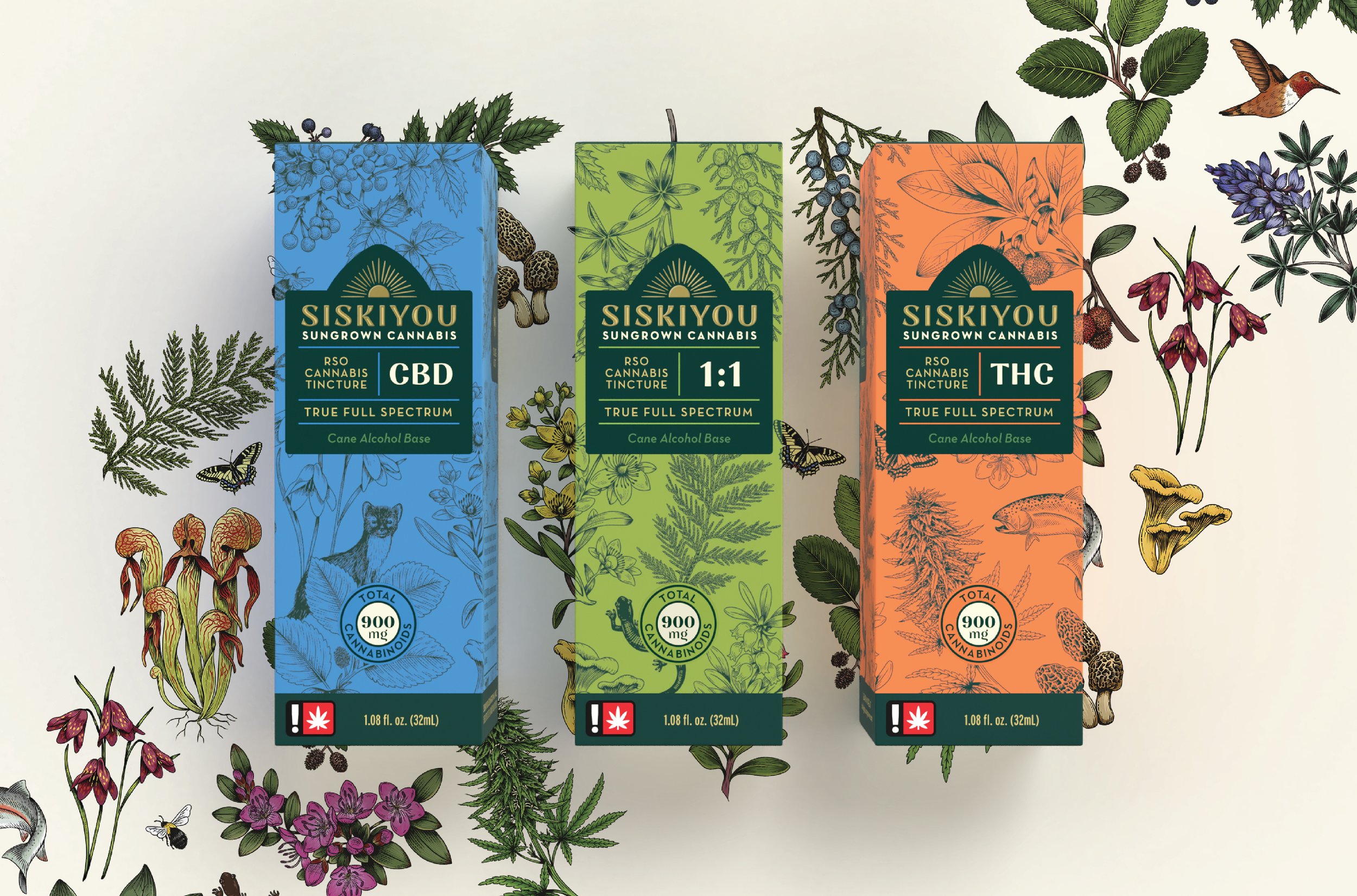
An Oregon Cannabis Brand Grows, Naturally
Case Study • Siskiyou Sungrown
-
Siskiyou Sungrown cultivates the therapeutic power of cannabis. Since the 1990s, owners Cedar and Madrone Grey’s business has been a journey to helping those with critical health conditions heal naturally. Originally medicinal cannabis growers, today they impeccably farm high-quality cannabis plants at the edge of Southern Oregon's Klamath-Siskiyou mountain wilderness. The legalization of cannabis led Siskiyou Sungrown to further develop its line of tinctures and RSO oils with full-spectrum plant benefits and high potency to reach a growing consumer base. By 2021, the surging recreational market— expected to hit $33 billion in the US (Fortune)—exploded in new brands with varying degrees of quality and infused with drug culture misinformation. Siskiyou Sungrown needed a redesign that expressed its premium position, integrity and differentiator. Flint delivered a new design program to elevate their position, tell their story, educate clearly and express the power of nature in their products.
-
Flint helped Siskiyou Sungrown define their brand story to leverage their southern Oregon roots and their history of focus on the medicinal benefits of cannabis.
Flint updated the Siskiyou Sungrown messaging hierarchy emphasizing the key selling points most important to a broad cannabis consumer.
Flint redesigned the Siskiyou Sungrown logo and created an accompanying system of packaging featuring new flora and fauna illustrations framing information graphics that told their story strategically, prioritizing education, understandability, the environment and sustainability.
-
Cedar and Madrone Grey always had a reverence for the therapeutic powers of cannabis. After witnessing firsthand the plant’s positive effects on those with critical medical conditions, Siskiyou Sungrown was born. However, the rest of the country hadn’t caught up yet. Originally, the Greys grew and sold through legal medicinal dispensaries, slowly building their customer base with a commitment to pure, whole-plant products harvested organically and sustainably in Williams, Oregon. When full legalization was implemented in 2016, Siskiyou Sungrown remained the standard for quality cannabis—with Cedar serving under Governor Kate Brown as an Oregon Cannabis Commissioner and Siskiyou distributing to over 300 Oregon dispensaries. But with so many new cannabis brands lighting up the market, the Greys had a new opportunity to lean into. Furthermore, they felt a responsibility to help this new consumer understand the alphabet soup of CBD and THC products and why theirs is definitively a cut above the rest.
-
Now that 43% of Americans reside in states that have legalized cannabis, the number of brands has inflated along with investor confidence in this previously illicit market (Forbes). While Siskiyou’s North Star has always been a brighter future for medicinal cannabis usage, with so many other brands selling alongside them, it was getting harder for the consumer to see the differentiator. Through our research, we learned that the industry was full of misunderstanding about what makes the most premium cannabis products. Because of Siskiyou Sungrown’s organic farming techniques and history of quality, wellness-focused products, we spotted the opportunity to connect with people who prioritize the environment and sustainability. Not only would this consumer cross-section appreciate the brand’s core values, they would be supported by Siskiyou’s ethos and authority in the medical field.
Our team got to work clarifying Siskiyou’s brand position and messaging within the category to emphasize their conscientious, pioneering and intellectual approach to cannabis farming. Our logo evolution championed their home at the base of the Siskiyou Mountains and the importance of the land on their product. We created commissioned custom illustrations working with botanical illustrator Charlotte Day and a new natural color system evocative of the biodiversity, flora and fauna of the region, leaving no package fold unturned. We also developed an icon library to call attention to key product messaging as educational moments for potentially confused consumers. These elements all worked in harmony to demonstrate the skill, craftsmanship and natural, unconventional approach used by Siskiyou to make Oregon’s finest cannabis products.
-
The Greys took to the new brand right away, its many elements resonant with their initial values in building their first farm all those years ago. Even with a product of increasing ubiquity as laws and consumer opinion continue to evolve, it’s still possible to differentiate. Leveraging the people, the place, personality and all the details surrounding a brand will ultimately bring truth, authenticity and meaning to its identity. Products are more than what’s on the box—they’re about everything that led to having that box in the first place.

The Smooth, Creamy Taste of a Successful Relaunch
Case Study • Nancy’s Oatmilk Yogurt
-
Nancy’s made probiotics palatable. Chuck and Sue Kesey were dairy pioneers in the ‘70s, innovating how people thought about their morning bowl of yogurt. So innovative, in fact, it only took about 45 years for the rest of the world to catch up to the benefits of probiotics. It’s only natural that Nancy’s would be the first to bring oatmilk yogurt to market in the US. Competition was quicker on the draw and the non-dairy market quickly became saturated. After five years since they’d debuted, plant-based products became overwhelmingly popular and Nancy’s no longer had to shoulder the responsibility of defining a whole new product. They refocused, reformulated, then came to Flint for a redesign to set them apart.
-
Flint helped Nancy’s relaunch their oatmilk yogurt to differentiate it in packed grocery aisles.
Flint established a new illustration style for the brand to communicate its flavor profiles, plant-based naturalness and quality ingredients.
Flint adjusted the Nancy’s logo, making it softer and creamier than ever, while locking it up with a playfully premium typeface and positioning it on packaging for greater visibility.
-
From humble Oregon roots, Nancy’s was the first yogurt to be sold with live probiotics. Even though many loved their products, they knew for some people dairy was a punch to the gut. That’s why they were also the first to sell oatmilk yogurt in the US. Even though their new, innovative (and delicious) product was first to market, the fruits of their labor were weighed down by the responsibility of defining a new product category. While Nancy’s did the heavy lifting, more and more plant-based yogurt brands filled consumers’ homes. Instead of getting discouraged, Nancy’s did what they do best: take a tasty spoonful of optimism and think differently. Free from the burden of presenting a new product, the team decided to reformulate their recipe, refocus their efforts on probiotics and flavor profiles, and relaunch better and creamier than ever.
-
We’ve long passed the times of plant-based products being inaccessible and confusing. They’re here to stay–go to any grocery store as proof. Vegan consumers have grown 500% since 2014 and now 48% of US consumers purchase both dairy and plant-based milks. Plant-based foods are now a $7 billion industry (Forbes). It’s no surprise that Nancy’s relaunch had to be impactful to contend with the myriad dairy-free options stocking refrigerators. Our competitive audit showed the Nancy’s team white packaging and soft colors reigned supreme, while many of them had no health or attribute differentiation. Nancy’s didn’t want to be another dairy brand looking to capitalize on the plant-based market. They were known for innovations, their scientific approach and above all their commitment to taste, texture and quality. They had always been ahead of the category. It was time to revisit our original designs for the brand and re-establish Nancy’s as the premier Probiotic Oatmilk Yogurt consumers can trust and feel good about.
Nancy’s Probiotics is approachable, whimsical, confident and honest. The new package design needed to strike a balance between playful and premium, eclectic and informative. First, we looked at the brand’s roots in the health food and counterculture movement of the ‘60s. We started with a bold and friendly typeface that paired with their logo for greater visibility at the shelf. Working with London-based artist, Charlotte Day, we established a new illustration style for Nancy’s that captures the naturalness of their ingredients and evokes a premium taste experience for the consumer. Fruits are featured as part of a whole plant, including blossoms and leaves, to visually communicate and appeal to plant-based consumers. Tying it all together, playful waves and bright colors flow around the outside of the package to mirror the creamy and flavorful plant-based yogurt on the inside. By leaning on color and illustration, we were able to simplify key messaging to better communicate at the shelf why Nancy’s has been trusted and loved by consumers for over 60 years.
-
The new look for Nancy’s Oatmilk celebrates the brand's heritage while connecting to modern consumers looking for good food that’s good for you. The result is all part of a deliciously balanced breakfast—and a design-forward, analytical thinking process. The Nancy’s team and the consumer couldn’t be happier with the redesign, noting it breathes new life into the brand. Like a good probiotic, we know it’s always good to keep changing, growing and evolving to keep clients and customers happy.
In addition to the case studies, I also provided Flint with accompanying social copy which leveraged the content and laddered up to their own brand values. This enabled them to build out their editorial calendar and show off their work.

If you think your family is rowdy, you haven’t met the Werners. These born-and-bred Oregonians entrusted us to overhaul their brand so they could take a bite out of the cured meats business once again—and they like to eat. Read our full case study for @wernerjerky and check out the rebrand. Just make sure you’re wearing a bib for all the drool.

Okay, you’re stranded on a tropical island and all you have to drink is @konabrewingco Spiked Island Seltzer. But it’s not even a variety pack! Which do you choose? Refreshing Tropical Punch, citrusy Starfruit Lime, exotic Strawberry Guava, or Hawaii classic Passionfruit Orange Guava?

Sure, when people hear “Tillamook” they instinctively think of cheese. But so much dairy is never good for you. We like to associate this beautiful Oregon town with cheese’s cool best friend who likes to work out but knows how to party: meat. @wernerjerky has been a Tillamook staple for 25 years, a home-grown family brand devoted to high-quality meat snacks worthy of any adventure and ready for everything.

When you think of hard seltzer, you probably think of a white can with some sans-serif font and maybe a whisper of a brand story. Not so for @konabrewingco Spiked Island Seltzer. Our mission was to translate Kona’s distinct Hawaiian vibes and recognizable identity to their new kind of Liquid Aloha. Crack one open and taste for yourself. We’ll wait, we’re on island time.