CHALLENGE
An AI-focused tech startup needs a brand.
SOLUTION
Develop an impossibly intuitive differentiated logo and image system.
ROLE
Art Director | Designer | Illustrator | Motion Designer
GETWHYS
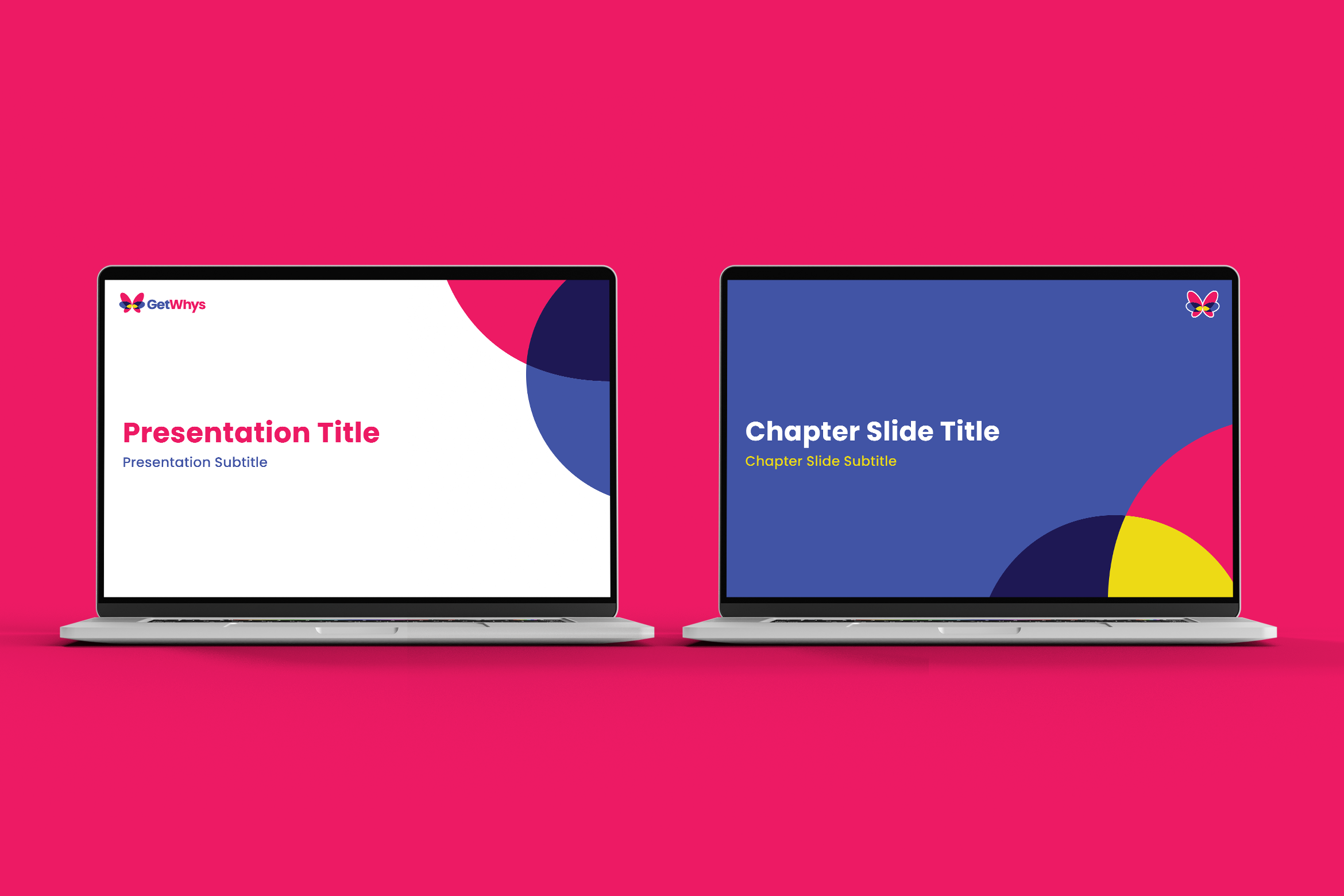
LOGO & BRANDING
GetWhys was breaking new ground in the tech world with their innovative approach to utilizing AI. So, they needed a bold brand to stand out in the space and support their different way of thinking.
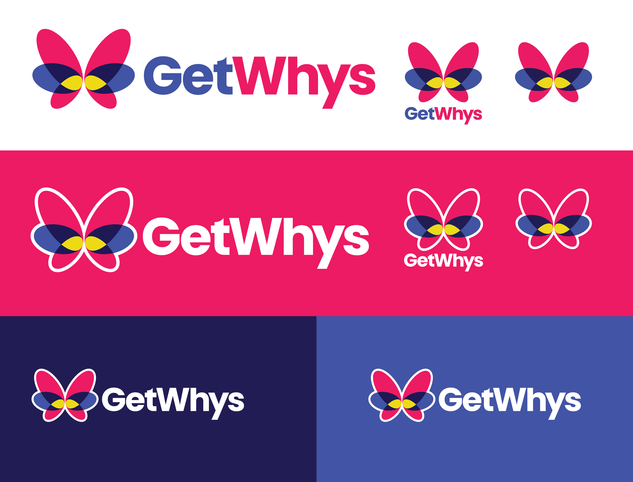
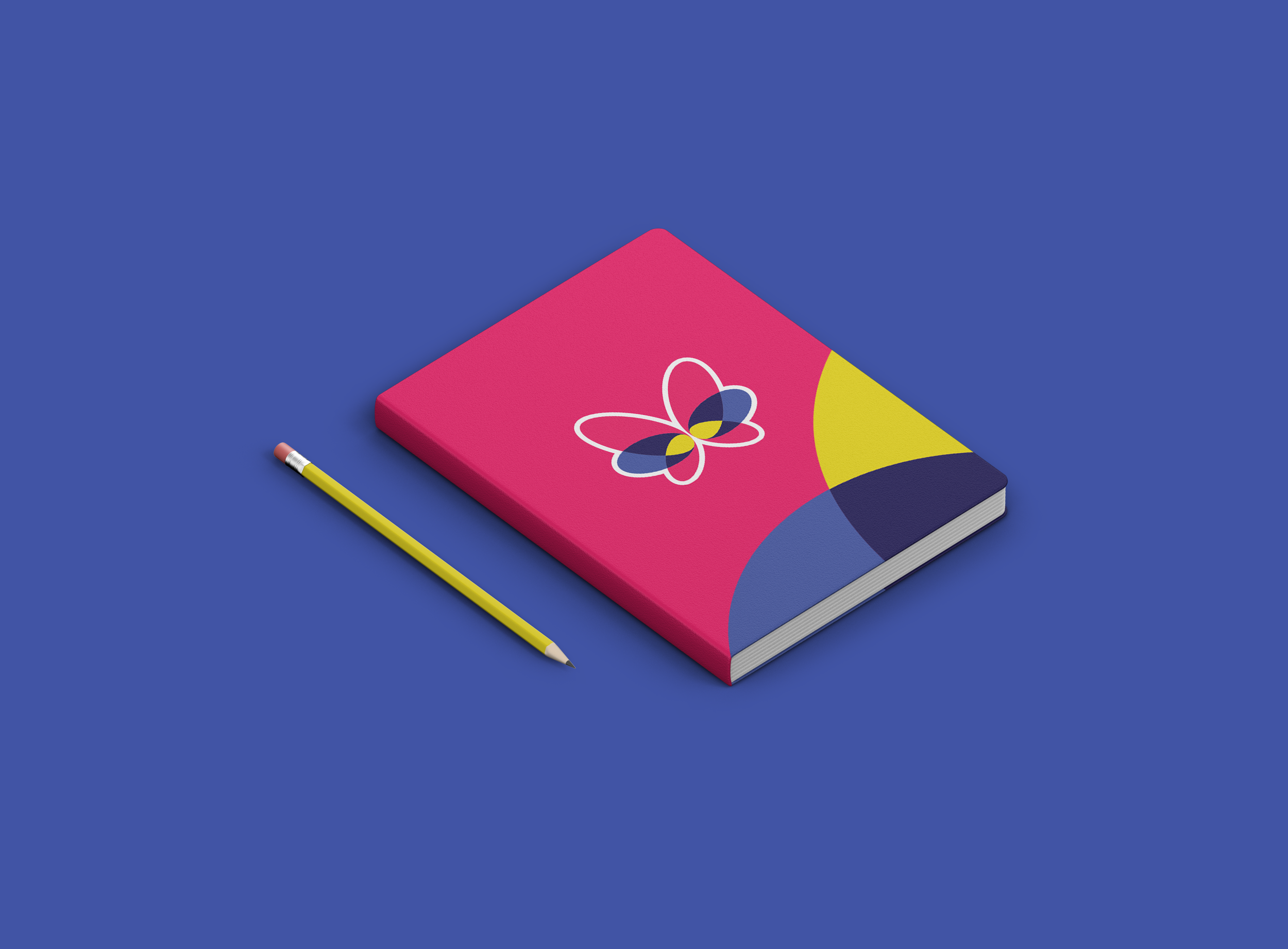
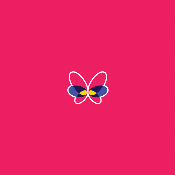
The butterfly connotes metamorphosis and change on its own. By building it out of different shapes, it becomes a symbol of everything GetWhys aims to do: help you get new insights from overlapping thoughts, ideas and feedback.
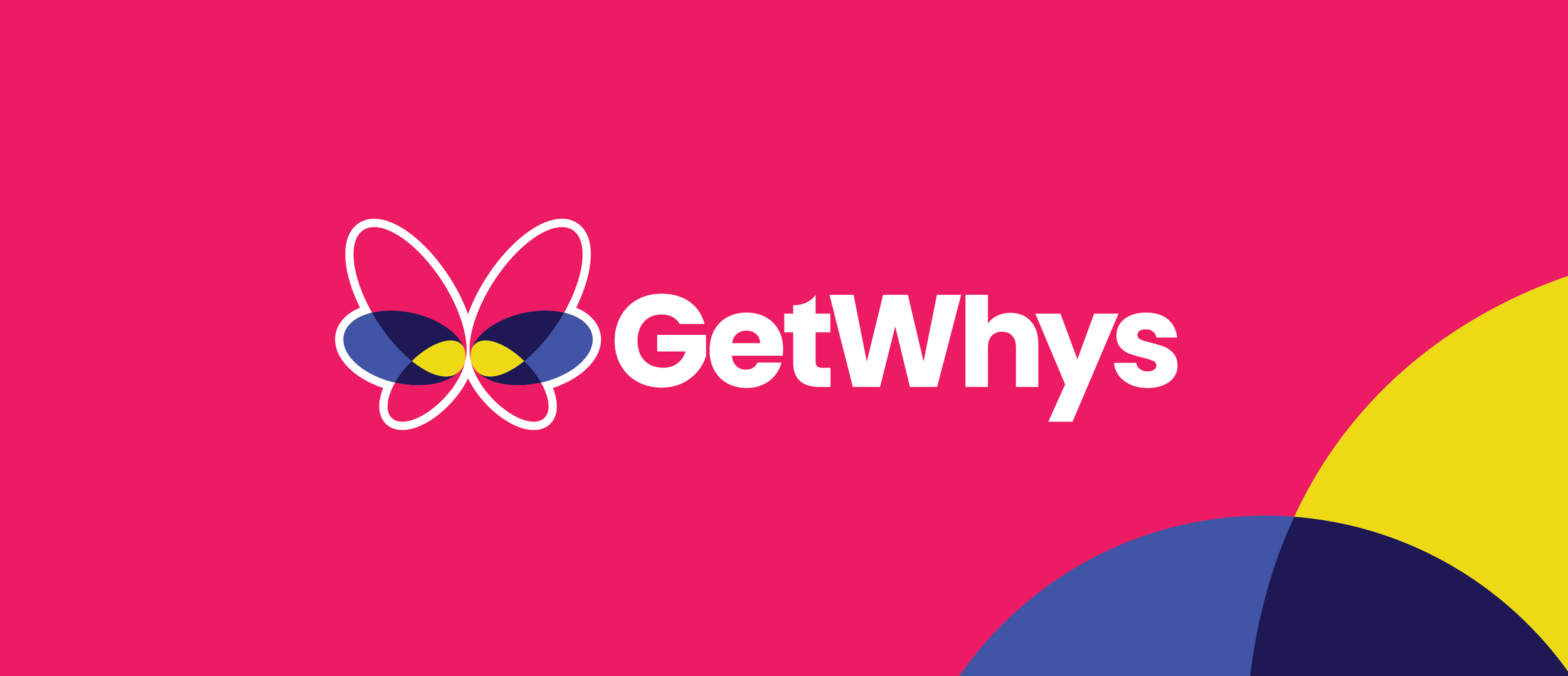
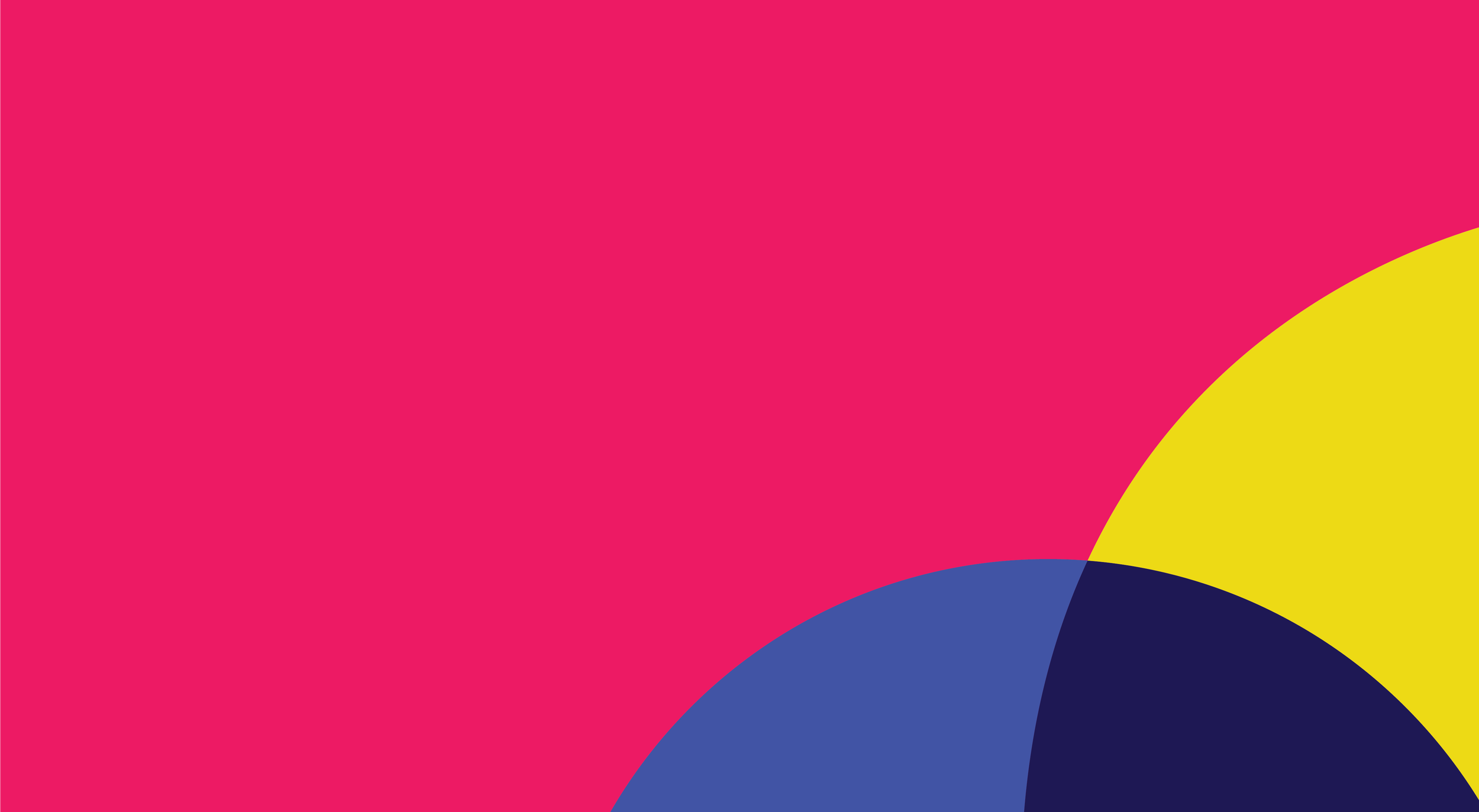
The electric color palette is not only differentiated in the boring and ugly tech space, it’s a fun approach to color theory—in that this is neither additive nor subtractive. The overlaps that build the basis of the brand are disparate colors coming together to create something totally new.


Hierarchy and structure also needed to be thought through when it came to product logos and iconography. Applied across a variety of collateral, the image system is flexible enough for their burgeoning product suite, web applications and a variety of other pieces.